14 Regression
Regression is a broad class of methods where predictor variables are used to predict a numeric response. In this class, we will primarily focus on simple linear regression, where a single numeric predictor is used and the model is linear.
14.1 Correlation coefficient
First, a brief aside on the correlation coefficient. Suppose we have a sample of pairs of observations \(x_i\), \(y_i\) drawn from \(X\), \(Y\) where each pair is independent from other pairs. Note however no assumption of independence is made between the variables, only between different pairs.
Similar to other statistics like mean or variance, there are both theoretical—i.e. population—and sample versions of the correlation coefficient definition. One is the underlying true value and the other is what you observe in your real dataset. The population correlation coefficient \(\rho\) is defined as:
\[ \rho=\frac{\e\big[(X-\mu_X)(Y-\mu_Y)\big]}{\sigma_X\sigma_Y} \]
where the numerator, also called the covariance of \(X\) and \(Y\), represents how much on average \(X\) and \(Y\) change together when compared to their means, and the denominator normalizes it by the product of their standard deviations.
Compare this with the sample correlation coefficient \(r\) which is defined as:
\[ r=\frac{\frac1{n-1}\sum(x_i-\bar x)(y_i-\bar y)}{s_xs_y} \]
Note similar to the definitions of \(s_x\), \(s_y\), the numerator also use \(n-1\) instead of \(n\) for its averaging. Also note that since these both involve a kind of averaging, the LLN assures us that \(r\to\rho\) as our sample size increases.
It’s easy to show that both \(\rho\), \(r\) always belong in the range \([-1,1]\), i.e. the correlation coefficient must always have absolute value \(\le1\).
Below shows a series of simulated jointly-normal \(x_i\), \(y_i\) observations drawn from \(X\), \(Y\) both with mean 0 and SD 1 but with various population correlation coefficient values:
library(mvtnorm) ; library(plotly) ; n <- 200
cor_dfs <- do.call(rbind, lapply(
  c(-20:20/20), \(r) rmvnorm(n,c(0,0), matrix(c(1,r,r,1), ncol=2)) %>% round(3) %>%
    as.data.frame %>% setNames(c("x","y")) %>% cbind(r=r))) %>% arrange(r, x)
plot_ly(cor_dfs, type="scatter", x=~x, y=~y, frame=~r, mode="markers", height=600) %>%
  config(displayModeBar=FALSE) %>% animation_opts(frame=100, transition=0) %>%
  layout(title = list(text="Simulated X,Y with various correlation coefficients r", x=.15),
         xaxis = list(range=list(-3,3)), yaxis = list(range=list(-3,3)),
         margin = list(l=0, r=10, b=135, t=50, automargin=FALSE), dragmode=FALSE) %>%
  animation_slider(currentvalue = list(font = list(color="#444444")))
From this, several things should be clear:
-
The correlation coefficient’s sign indicates the direction of the trend
Positive \(+\) sign indicates a positive relationship (slope \(>0\))
Negative \(-\) sign indicates a negative relationship (slope \(<0\))
-
The correlation coefficient’s absolute value indicates how “tight” the points are
- Absolute value close to 1 indicates the points are tight around the line
Correlation equal or close to 0 indicates little or no relationship (flat cloud of points)
14.1.1 Caveats
The correlation coefficient has a major caveat: it only measures the linear component of the relationship. If the relationship is non-linear, it may not be useful at all!
To be even more clear, the correlation coefficient can NOT be used to check linearity! This is why it’s important to plot your data first to make sure it’s linear before directly jumping into regression.
Below is a famous example of this know as the Anscombe’s quartet, which is built-in to R. This is a set of 4 \(x_i\), \(y_i\) datasets, each of which can be checked to have the same mean and SD in both \(x\) and \(y\), as well as the same correlation coefficient of about \(0.816\).
anscombe x1 x2 x3 x4 y1 y2 y3 y4
1 10 10 10 8 8.04 9.14 7.46 6.58
2 8 8 8 8 6.95 8.14 6.77 5.76
3 13 13 13 8 7.58 8.74 12.74 7.71
4 9 9 9 8 8.81 8.77 7.11 8.84
5 11 11 11 8 8.33 9.26 7.81 8.47
6 14 14 14 8 9.96 8.10 8.84 7.04
7 6 6 6 8 7.24 6.13 6.08 5.25
8 4 4 4 19 4.26 3.10 5.39 12.50
9 12 12 12 8 10.84 9.13 8.15 5.56
10 7 7 7 8 4.82 7.26 6.42 7.91
11 5 5 5 8 5.68 4.74 5.73 6.89
anscombe %>%
  pivot_longer(everything(), names_to=c(".value","set"), names_pattern="(.)(.)") %>%
  group_by(set) %>% summarize(xbar = mean(x), ybar = mean(y), sx = sd(x),
                              sy = sd(y), r = cor(x,y))
# A tibble: 4 × 6
set xbar ybar sx sy r
<chr> <dbl> <dbl> <dbl> <dbl> <dbl>
1 1 9 7.50 3.32 2.03 0.816
2 2 9 7.50 3.32 2.03 0.816
3 3 9 7.5 3.32 2.03 0.816
4 4 9 7.50 3.32 2.03 0.817And yet, when plotted it’s clear that these are 4 extremely different datasets, only one of which is actually appropriate for a linear regression model:
anscombe %>%
  pivot_longer(everything(), names_to=c(".value","set"), names_pattern="(.)(.)") %>%
  mutate(set = paste("set",set)) %>%
  ggplot(aes(x=x,y=y)) + geom_point() + geom_smooth(method=lm, se=F) +
  facet_wrap(~set, scales="free") + ggtitle("Anscombe's quartet datasets, each r ≈ 0.816")
As an even more extreme example, here’s 4 datasets I cooked up, each of which has 0 correlation. Again, only one of which is actually appropriate for a linear regression model:
# pick seed where rmvnorm generates dataset with especially low r
set.seed(841)
n <- 12
rmvnorm(n,c(0,0),matrix(c(1,0,0,1),ncol=2)) %>% as.data.frame %>% setNames(c("x1","y1")) %>%
  add_column(
    x2 = cos(seq(0, 2*pi*(1-1/n), length.out=n)),
    y2 = sin(seq(0, 2*pi*(1-1/n), length.out=n)),
    x3 = seq(-1, 1, length.out=n),
    y3 = x3^2-1,
    x4 = x3,
    y4 = abs(sin(x4*pi))) %>%
  pivot_longer(everything(), names_to=c(".value","set"), names_pattern="(.)(.)") %>%
  mutate(set = case_match(set, "1"~"set 1: no correlation", "2"~"set 2: circle",
                          "3"~"set 3: parabola", "4"~"set 4: McDonald's")) %>%
  group_by(set) %>% mutate(x = (x-mean(x))/sd(x), y = (y-mean(y))/sd(y)) %>%
  ggplot(aes(x=x,y=y)) + geom_point() + geom_smooth(method=lm, se=F) +
  facet_wrap(~set, scales="free") + ggtitle("Additional quartet of datasets, each r = 0")
All this is to demonstrate that the correlation should NOT be used to determine if linear regression is appropriate. It can ONLY be used to assess the strength of the relationship AFTER you’ve already visually checked the dataset is in fact linear by plotting!
14.1.2 Correlation in R
In R, the sample correlation coefficient \(r\) is computed using the cor() function, which takes two vectors of the \(x_i\), \(y_i\) observations. The order of input does not matter.
# continuing with set 1 from Anscombe's quartet
cor(anscombe$x1, anscombe$y1)
[1] 0.8164205 r
1 0.8164205
# manual computation if desired
anscombe %>%
  summarize(r = sum((x1-mean(x1))*(y1-mean(y1)))/(length(x1)-1)/sd(x1)/sd(y1))
r
1 0.8164205There are additional optional arguments like use which can specify which observations to use if there are missing values, or method which can be set to compute other related statistics such as Kendall’s or Spearman’s correlation coefficients which are beyond our scope (our method above, which is the default, is called Pearson’s correlation coefficient).
14.2 Model notation
Now, let’s move on to the actual modeling notation used. Again, let’s suppose we draw a sample of \(n\) pairs \((x_i,y_i)\) from some population variables \(X,Y\), and suppose we’ve visually identified a linear regression model as appropriate, based on graphically assessing the degree of linearity, as well as possibly checking the correlation coefficient.
Our theoretical linear model equation is then the following:
\[ y_i=\beta_0+\beta_1x_i+\ep_i \]
\(x_i\), \(y_i\) are the actual data points in our sample,
\(\beta_0\) is the true intercept of the line,
\(\beta_1\) is the true slope of the line,
-
\(\ep_i\) are the errors of each point, which model the random fluctuations inherent to every measurement. These are assumed to be distributed \(\ep_i\sim\n(0,\sigma)\), i.e. they are modeled as:
- Normally distributed, with
- Mean zero,
- Constant variance, and
- Independent from one another.
At this point, it’s important to take note of the following:
The statement of this model equation here implicitly involves an assumption that the underlying process between \(X,Y\) is truly linear. Again, this linearity assumption can NOT be checked with the correlation coefficient; it must be visually assessed by plotting the data.
Here, \(\beta_0\), \(\beta_1\) represent the true underlying intercept & slope values that generate the data (assuming the data is in fact linear), NOT a best fit line based on a sample.
\(x_i\), \(y_i\), \(\ep_i\) all have \(i\) indices since they vary for each point, but \(\beta_0\), \(\beta_1\) do NOT have indices, since the points are supposed to all fall on ONE line with some true slope and intercept.
The \(x_i\) are actually treated as constants, just like \(\beta_0\), \(\beta_1\), which means the only variable on the right hand side is \(\ep_i\).
The assumptions on \(\ep_i\) mean that the \(y_i\) points are distributed normally about the regression line. In other words, within every vertical slice along the line, the points follow a normal distribution along the y-axis.
14.2.1 Simulated demo
As a quick demo of this setup and notation, suppose we pick true coefficients \(\beta_0=-3\), \(\beta_1=0.5\). Using this, let’s generate \(n=10\) observations where \(x_i\) are uniformly sampled from \([10,20]\), and \(\sigma=2\).
Using these values, we can simulate one possible sample of \(x_i\), \(y_i\) values drawn from \(X,Y\) with:
# define values for simulation demo
b0 <- -3 ; b1 <- 0.5 ; n <- 10 ; m <- 10 ; M <- 20 ; sigma <- 2
# pick a convenient point in quadrant IV as example
i <- which.min((scale(x)[,1]-.5)^2+(scale(y)[,1])^2)

ggplot(tibble(x,y), aes(x=x,y=y)) + geom_point() +
  geom_segment(aes(color="yi",x=x[i],y=0,yend=y[i]),linewidth=.7) +
  geom_segment(aes(color="xi",y=y[i],x=10,xend=x[i]),linewidth=.7) +
  geom_segment(aes(color="εi",x=x[i],y=y[i],yend=(b0+b1*x[i])),linewidth=.7) +
  geom_point(aes(color="i-th point",x=x[i],y=y[i]),size=3,shape="square") +
  stat_smooth(aes(color="best fit line"),method=lm,se=F,linewidth=1,linetype="dashed",fullrange=T) +
  geom_abline(aes(color="true line", slope=b1, intercept=b0),linewidth=1,key_glyph="path") +
  scale_x_continuous(breaks=seq(10,20,2), labels=seq(10,20,2),
                     limits=c(10,20), expand=0, minor_breaks=10:20) +
  scale_y_continuous(breaks=seq(0,10,1), labels=seq(0,10,1),
                     limits=c(0,10), expand=0, minor_breaks=NULL) +
  scale_color_manual(breaks=c("best fit line","true line","i-th point","εi","yi","xi"),
                     values=c("#7570B3FF","#1B9E77FF","#666666FF","#E6AB02FF","#A6761DFF","#E7298AFF")) +
  theme(legend.key.width=unit(2.1,"line")) +
  labs(color = "Legend", title = "Simulated linear model demo")
14.2.2 Fitting process
Without going into too much detail, the typical fitting method, called Ordinary Least Squares (OLS) involves finding the line that minimizes the sum of squared errors vs the data points.
Suppose we “test out” a hypothetical line with coefficients \(\beta_0',\beta_1'\). The sum of the squared errors vs the data points, also called the loss function \(\ell(\beta_0',\beta_1')\), is defined as:
\[ \ell(\beta_0',\beta_1')=\sum_{i=1}^n(y_i-(\beta_0'+\beta_1'x_i))^2 \]
Note this is a function of \(\beta_0',\beta_1'\), i.e. we can “test out” different possible values of the coefficients, and evaluated the “loss” of each guess—i.e. how “bad” the guess is—by plugging it into the function to get the sum-squared-errors.
Visually, this looks like taking the vertical error bars from each data point to the “test” line and building a square with that as one side, then adding up the areas of each square to get the total sum-squared-errors. Then, the best fit line is the line that minimizes these sum-squared-errors:
bh1 <- cor(x,y)*sd(y)/sd(x)
bh0 <- mean(y)-bh1*mean(x)
ggplot(tibble(x,y), aes(x=x,y=y)) +
  geom_rect(aes(xmin=x,xmax=x+(y-(x*bh1+bh0))*if_else(x>16.5|y>1&y<3,-1,1),
                ymin=y,ymax=x*bh1+bh0,color="squared errors"),alpha=.1) +
  geom_segment(aes(yend=x*bh1+bh0, color="errors"),linewidth=1) +
  stat_smooth(aes(color="best fit line"),method=lm,se=F,fullrange=T,linewidth=1) +
  geom_point(size=2) +
  scale_x_continuous(breaks=seq(10,20,2), labels=seq(10,20,2),
                     limits=c(10,20), expand=0, minor_breaks=10:20) +
  scale_y_continuous(breaks=seq(0,10,1), labels=seq(0,10,1),
                     limits=c(0,10), expand=0, minor_breaks=NULL) +
  scale_color_manual(breaks=c("best fit line","errors","squared errors"),
                     values=c("#7570B3FF","#E6AB02FF","#666666FF")) +
  labs(color = "Legend", title = "Least squares visualized for best fit line")
To find this best fit line, we solve for the local minimum of the loss function, where we know the partial derivatives with respect to \(\beta_0',\beta_1'\) must both vanish:
\[ \text{solve}\quad \frac{\partial\ell(\beta_0',\beta_1')}{\partial\beta_0'}=0 \quad\text{and}\quad \frac{\partial\ell(\beta_0',\beta_1')}{\partial\beta_1'}=0 \]
This is not extremely difficult to solve but we omit the details.
14.3 Best fit coefficients
One can show that the best fit coefficients \(\hat\beta_0\), \(\hat\beta_1\) that minimize the loss function are:
\[ \hat\beta_1~=~r\cdot\frac{s_y}{s_x}~~~~\\ \hat\beta_0~=~\bar y-\hat\beta_1\bar x \]
Note these are purely functions of the sample statistics \(\bar x\), \(\bar y\), \(s_x\), \(s_y\), \(r\), and straightforward to compute.
Also note the second equation implies the following key fact: the best fit line always passes through the point \((\bar x,\bar y)\), since this point clearly satisfied \(\bar y=\hat\beta_0+\hat\beta_1\bar x\).
Another way of thinking about it, the best fit intercept \(\hat\beta_0\) is determined automatically by seeing where the line with slope \(\hat\beta_1\) that goes through \((\bar x,\bar y)\) intersects the y-axis.
It can be shown that theoretically the best fit coefficients \(\hat\beta_0\), \(\hat\beta_1\) as defined above are not only unbiased, i.e. no systematic deviation from the true value, but also least variance (among linear estimators), i.e. in some sense the most “precise” estimation of the true values \(\beta_0\), \(\beta_1\), and that as your sample size grows, we’ll have \(\hat\beta_0\to\beta_0\) and \(\hat\beta_1\to\beta_1\).44
14.4 Data example
For a first data example, let’s example a historic ice cream consumption dataset provided by Kadiyala.45 The data, found in icecream.csv reports ice cream consumption per capita in pints vs mean temperature in Farenheit over a series of 4-week periods between 1951-53 in a region in Michigan.
# set comment="#" to ignore description lines at top of file,
# then select main columns of interest
icecream <- read_csv("https://bwu62.github.io/stat240-revamp/data/icecream.csv",
                     comment="#") %>% select(consumption, temperature)
icecream
# A tibble: 29 × 2
consumption temperature
<dbl> <dbl>
1 0.386 41
2 0.374 56
3 0.393 63
4 0.425 68
5 0.406 69
# ℹ 24 more rows
ggplot(icecream,aes(x=temperature, y=consumption)) + geom_point() +
  geom_smooth(method=lm, se=F) + labs(y="Consumption (pints per capita)",
  x="Mean temperature (F)", title="Ice cream consumption vs temperature")
We can see this dataset looks quite linear. We can also compute the correlation:
# A tibble: 1 × 1
      r
  <dbl>
1 0.786
All signs suggest this is a good candidate for linear regression.
14.4.1 Fit manually
We can use the expressions shown earlier to manually compute the best fit slope and intercept \(\hat\beta_1\), \(\hat\beta_0\).
# <<- is a dirty R trick to globally assign a variable from anywhere
icecream %>% summarize(
  xbar = (xbar <<- mean(temperature)),
  ybar = (ybar <<- mean(consumption)),
  sx   = (sx   <<- sd(temperature)),
  sy   = (sy   <<- sd(consumption)),
  r    = (r    <<- cor(consumption, temperature)),
  b1   = (b1   <<- r * sy / sx),
  b0   = (b0   <<- ybar - b1 * xbar))
# A tibble: 1 × 7
xbar ybar sx sy r b1 b0
<dbl> <dbl> <dbl> <dbl> <dbl> <dbl> <dbl>
1 48.3 0.353 16.2 0.0563 0.786 0.00273 0.221
# check fit by manually plotting best fit line (cross added at xbar, ybar)
library(latex2exp)
ggplot(icecream, aes(x=temperature, y=consumption)) + geom_point() +
  geom_point(aes(x=xbar, y=ybar), shape=3, size=6) +
  geom_abline(slope=b1, intercept=b0, color="red") +
  labs(x="Mean temperature (F)", y="Consumption (pints per capita)", title=TeX(
    "Ice cream consumption vs temperature (cross shows $\\bar{x},\\bar{y}$)"))
14.5 Fit with lm()
Of course we can also fit using R. The function to use is lm(), which is short for Linear Model. There are many advanced arguments, but minimally these should always be specified:
-
formula, the 1st argument, expects an R “formula”, which is a special object created with the~character and which specifies a dependency structure for variables (see this page for details)- For simple linear regression, this formula will be
response ~ predictorwhereresponseandpredictorare column names of the \(Y\) and \(X\) variables in your data frame
- For simple linear regression, this formula will be
data, the 2nd argument, expects the data frame with your variables
You can also use two vectors directly for the formula specification instead of using columns in a data frame, but this is generally not recommended since this precludes certain additional useful features down the road. For best results, always use lm() with columns from a data frame!
The formula specification is always in order of response ~ predictor, i.e. Y ~ X, and NOT the other way around; the order of variables here is not interchangeable!
# fit the model, saving the output object which will be useful later
lm_icecream <- lm(consumption ~ temperature, data = icecream)
lm_icecream
Call:
lm(formula = consumption ~ temperature, data = icecream)

Coefficients:
(Intercept)  temperature
   0.220727     0.002735
# print a more complete summary output of the model
summary(lm_icecream)
Call:
lm(formula = consumption ~ temperature, data = icecream)

Residuals:
      Min        1Q    Median        3Q       Max
-0.061253 -0.023111 -0.000007  0.025382  0.053154

Coefficients:
             Estimate Std. Error t value Pr(>|t|)
(Intercept) 0.2207275  0.0210905  10.466 5.30e-11 ***
temperature 0.0027346  0.0004144   6.598 4.44e-07 ***
---
Signif. codes:  0 '***' 0.001 '**' 0.01 '*' 0.05 '.' 0.1 ' ' 1

Residual standard error: 0.03547 on 27 degrees of freedom
Multiple R-squared:  0.6172,    Adjusted R-squared:  0.6031
F-statistic: 43.54 on 1 and 27 DF,  p-value: 4.444e-07
There’s a lot here to unpack, some of which we’ll get to later, but for now we can see the results match our manual computation, and we have \(\hat\beta_0=0.2207\), \(\hat\beta_1=0.002734\).
14.6 Model validation
A very important step at this stage is to do model validation, which means check the fit makes sense and nothing unusual or unexpected is happening with your fit. This is usually done by analyzing the residuals of the fit.
14.6.1 Residuals
Recall the best fit line is determined by minimizing the sum-squared-errors. Once the best fit line is found, taking the difference between \(y_i\) and the best-fit predictions \(\hat y_i\) gives our sample estimate of the errors, which we call \(\hat\ep_i\) or the residuals of the fit and are defined:
\[ \hat\ep_i~=~y_i-\hat y_i~=~y_i-\left(\hat\beta_0+\hat\beta_1x_i\right) \]
These \(\hat\ep_i\) are treated as a sample of \(\ep_i\) which remember we assumed to have distribution \(\ep_i\sim\n(0,\sigma)\).
The reason this assumption is made is simply that pure random noise is generally normal, mean 0, and constant variance, so if our model is correct and we have correctly captured the underlying linear relationship, whatever is leftover after our fit should look like pure noise!
These assumptions are usually checked by examining the residual vs fitted and QQ plots for the fit.
14.6.2 Plotting residuals
Let’s first compute the model’s residuals for each data point:
# recall we still have best fit coefficients b1, b0 defined from earlier
icecream <- icecream %>% mutate(residuals = consumption - (b0 + b1*temperature))
icecream
# A tibble: 29 × 3
consumption temperature residuals
<dbl> <dbl> <dbl>
1 0.386 41 0.0532
2 0.374 56 0.000135
3 0.393 63 -0.00000701
4 0.425 68 0.0183
5 0.406 69 -0.00341
# ℹ 24 more rows
# check our residuals using R's built-in resid() function
icecream$residuals
[1] 5.315410e-02 1.351619e-04 -7.009962e-06 1.832001e-02 -3.414586e-03
[6] -5.447620e-02 -6.053782e-02 -6.125347e-02 -3.923453e-02 -3.035777e-02
[11] -1.129615e-02 6.173041e-03 2.076547e-02 -1.211130e-02 9.869758e-03
[16] -1.200701e-02 5.238163e-02 2.538163e-02 -1.794539e-02 -4.280322e-02
[21] -2.204969e-02 -2.311130e-02 -2.423453e-02 3.143845e-02 1.170385e-02
[26] 4.803087e-02 4.315410e-02 5.307355e-02 4.125839e-02 [1] 5.315410e-02 1.351619e-04 -7.009962e-06 1.832001e-02 -3.414586e-03
[6] -5.447620e-02 -6.053782e-02 -6.125347e-02 -3.923453e-02 -3.035777e-02
[11] -1.129615e-02 6.173041e-03 2.076547e-02 -1.211130e-02 9.869758e-03
[16] -1.200701e-02 5.238163e-02 2.538163e-02 -1.794539e-02 -4.280322e-02
[21] -2.204969e-02 -2.311130e-02 -2.423453e-02 3.143845e-02 1.170385e-02
[26] 4.803087e-02 4.315410e-02 5.307355e-02 4.125839e-02
# plot residuals (since residuals=response-predicted, predicted=response-residuals)
ggplot(icecream, aes(x=temperature, y=consumption)) +
  geom_segment(aes(yend=consumption-residuals), color="#E6AB02FF") + geom_point() +
  geom_abline(slope=b1, intercept=b0, color="red") +
  labs(title="Ice cream consumption vs temperature (with residuals)",
  x="Mean temperature (F)", y="Consumption (pints per capita)")
These can then be directly plotted both against the predicted \(\hat y_i\) and in a QQ plot using methods we’ve learned before (exercise left to reader). Alternatively, there’s also the rare slick base R shortcut here:
plot(lm_icecream, 1)
plot(lm_icecream, 2)
From these plots we can see the residuals do appear to be normal, 0-mean, and constant-variance, so everything looks good. For examples of bad residual plots, see this page or this page.
In R, when a “generic” function like plot() or summary() is used with objects of special classes like the output of lm(), they actually redirect and call the functions plot.lm() or summary.lm(), which are specific implementations of the generic function for that class.
This means you need to search for those specific functions’ help pages if you want additional details on how they work.
14.7 Inference
Of course, inference is also possible for regression. We can easily construct confidence intervals for \(\hat\beta_0\), \(\hat\beta_1\) or perform hypothesis tests for \(\beta_0\), \(\beta_1\).
Generally, the most common inference questions to ask is if the data shows a significant linear relationship, and this is usually answered by either computing an interval for \(\hat\beta_1\), or trying to reject \(\beta_1=0\), since these will affirm the significance of the \(\beta_1x_i\) term in the linear model equation. Much less commonly, inference may also be done on the intercept.
14.7.1 T-distribution
In both cases, for either slope or intercept, the process of inference is straightforward: use a T-distribution with \(\nu=n-2\) degrees of freedom, with the corresponding standard errors:
\[ \text{(intercept)}~~\se(\hat\beta_0)=\hat\sigma\cdot\sqrt{\frac1n+\frac{\bar x^2}{s_x^2(n-1)}}~,\\ \text{(slope)}~~\se(\hat\beta_1)=\hat\sigma\cdot\sqrt{\frac1{s_x^2(n-1)}}~,\,~\\ ~~~~~~~\text{where}~~\hat\sigma=\sqrt{\frac1{n-2}\sum\hat\ep_i^2} \]
For our example dataset, these can be computed as:
# recall we still have xbar, sx globally defined from earlier,
# use <<- again to globally define sigma, s0, s1 by formulae above
icecream %>% summarize(
  n = (n <<- n()),
  sigma = (sigma <<- sqrt(1/(n-2) * sum(residuals^2))),
  s0 = (s0 <<- sigma * sqrt(1/n + xbar^2/(sx^2*(n-1)))),
  s1 = (s1 <<- sigma * sqrt(1/(sx^2*(n-1))))
) %>% data.frame  # convert to base R data frame, which prints more digits by default
n sigma s0 s1
1 29 0.03546869 0.02109051 0.0004144333For the purposes of 240, you can always read these from the summary() output, which will either be provided for you or easily computed in R whenever regression inference is involved.
Once again, here’s the output of summary()
summary(lm_icecream)
Call:
lm(formula = consumption ~ temperature, data = icecream)

Residuals:
      Min        1Q    Median        3Q       Max
-0.061253 -0.023111 -0.000007  0.025382  0.053154

Coefficients:
             Estimate Std. Error t value Pr(>|t|)
(Intercept) 0.2207275  0.0210905  10.466 5.30e-11 ***
temperature 0.0027346  0.0004144   6.598 4.44e-07 ***
---
Signif. codes:  0 '***' 0.001 '**' 0.01 '*' 0.05 '.' 0.1 ' ' 1

Residual standard error: 0.03547 on 27 degrees of freedom
Multiple R-squared:  0.6172,    Adjusted R-squared:  0.6031
F-statistic: 43.54 on 1 and 27 DF,  p-value: 4.444e-07
Under the
Std. Errorcolumn, we can see \(\se(\hat\beta_0)=0.02109\), \(\se(\hat\beta_1)=0.0004144\).Below that, next to
Residual standard error, we can see \(\hat\sigma=0.03547\), which is our estimate of \(\sigma\), i.e. the standard deviation of the \(\ep_i\) errors.Additionally, we see \(\nu=n-2=27\) which is the degrees of freedom needed for our t-distribution.
14.7.2 Hypothesis test
Now, we can do all the inference we desire. Suppose we want to see if there is a significant linear relationship. In other words, we test the following hypotheses:
\[ H_0:\beta_1=0\\ H_a:\beta_1\ne0 \]
We compute our t-statistic and p-value similar to the one-sample t-test:
\[ t_\obs~=~\frac{\hat\beta_1-0}{\se(\hat\beta_1)}~=~\frac{0.002735}{0.0004144}~=~6.598~\sim~T_{n-2} \]
# recall we have b1, s1 defined as the slope and its standard error
# since t_obs is positive, take twice the upper tail are
2 * (1 - pt(b1/s1, df=n-2))
[1] 4.443997e-07These all match the summary, and we can conclude there’s very strong evidence to suggest a significant linear relationship exists.
14.7.3 Confidence interval
We can also compute a 95% confidence interval for \(\beta_1\)
\[ \text{$C\%$ or $(1\!-\!\alpha)$ interval}~=~\hat\beta_1~\pm~t_{\alpha/2,\,n-2}\cdot\se(\hat\beta_1) \]
[1] 0.001884249 0.003584943We can check this with the confint() function:
confint(lm_icecream, level = 0.95) 2.5 % 97.5 %
(Intercept) 0.177453305 0.264001622
temperature 0.001884249 0.003584943Again, everything agrees! Our 95% confidence interval for the true slope \(\beta_1\) is \((0.0019,0.0036)\).
14.8 Prediction
Once we have our model, we can use it to make predictions for new \(X\) observations.
Two things to keep in mind here:
Only new \(X\) values within (or perhaps only slightly beyond) our range of observed \(x_i\) values should be considered as viable candidates for prediction with our model. Far outside our \(x_i\), we simply have no data and the linear model may NOT be valid therein.
Linear models are intended to predict the average \(Y\) for a given \(X\), not an individual \(Y\) observation. Individual observations are of course subject to additional \(\ep_i\) errors.
Suppose we have a new period of time with mean temperature 30°F. What would our model predict for this period’s average ice cream consumption in pints per capita?
# again, recall we have b0, b1 defined as the fitted intercept and slope
b0 + b1*30
[1] 0.3027653We can also check this with predict(), which is a generic function that calles predict.lm(). Using this function, we can easily make several new predictions at once. Suppose we wish to see average consumption predictions for temperatures 30,40,…,70°F:
# predict() expects lm object + data frame with new X values in column of same name
predict(lm_icecream, newdata = tibble(temperature=3:7*10))
1 2 3 4 5
0.3027653 0.3301113 0.3574573 0.3848032 0.4121492
ggplot(icecream, aes(x=temperature, y=consumption)) + geom_point() +
  geom_abline(slope=b1, intercept=b0, color="red") +
  geom_point(data=cbind(x=3:7*10,y=predict(lm_icecream,list(temperature=3:7*10))),
             aes(x,y,color="new predictions\nat 30,40,…,70"),size=3,shape="square") +
  scale_color_manual(values=c("blue")) +
  labs(title="Ice cream consumption vs temperature (with new predictions)",
  x="Mean temperature (F)", y="Consumption (pints per capita)")
14.8.1 More intervals
We can also augment our new prediction with one of two new kinds of confidence intervals:
A confidence interval for the mean response (not to be confused with the coefficient confidence intervals discussed previously) is an interval for the predicted mean response for a given new predictor value.
A prediction interval for a single observation, which is an interval for the response value of one newly observed data point.
Another way of thinking about it is that a confidence interval is an interval for the best fit line that we computed through our data, whereas a prediction interval is an interval for our cloud of data points.
From this, it shouldn’t be surprising that a prediction interval will typically be much wider than a confidence interval, since it needs to account for the additional point-to-point variation in the dataset.
Suppose we have a new observation \(X=x_\new\). Again we will use a t-distribution with \(\nu=n-2\) degrees of freedom, with the following standard error formulae for the confidence & prediction intervals:
\[ \se(\hat y)=\hat\sigma\sqrt{\frac1n+\frac{(x_\new-\bar x)^2}{s_x^2(n-1)}}~~~~~~~~~~~~~~~~\\ \se(y_\new)=\hat\sigma\sqrt{1+\frac1n+\frac{(x_\new-\bar x)^2}{s_x^2(n-1)}}~,~\text{where} \]
\(\se(\hat y)\) is the confidence interval standard error for \(\hat y=\hat\beta_0+\hat\beta_1x_\new\), the model prediction for \(x_\new\),
\(\se(y_\new)\) is the prediction interval standard error for \(y_\new\), a hypothetical unobserved responsed that could correspond to \(x_\new\),
and \(\hat\sigma\) is again the residual standard error as previously defined.
Then, we have the following formulae for the confidence & prediction intervals:
\[ \text{$C\%$ or $(1\!-\!\alpha)$ confidence interval}\,=~\hat y\:\pm~t_{\alpha/2,\,n-2}\cdot\se(\hat y)~~~~~\\ \text{$C\%$ or $(1\!-\!\alpha)$ prediction interval}~=~\hat y~\pm~t_{\alpha/2,\,n-2}\cdot\se(y_\new) \]
Suppose we wish to compute 95% confidence and prediction intervals for our new observation of 30°F. We know from earlier this corresponds to predicted \(\hat y=0.3027\).
# 95% confidence interval for new X at 30
(b0+b1*30) + c(-1,1) * qt(0.975,n-2) * sigma*sqrt(1/n+(30-xbar)^2/(sx^2*(n-1)))
[1] 0.2821262 0.3234045
# 95% prediction interval for new X at 30
(b0+b1*30) + c(-1,1) * qt(0.975,n-2) * sigma*sqrt(1+1/n+(30-xbar)^2/(sx^2*(n-1)))
[1] 0.2271196 0.3784111We can interpret these two as follows:
We are 95% confident the true mean ice cream consumption at mean temperature of 30°F is between 0.28 and 0.32 pints per capita.
We are 95% confident the ice cream consumption for a single new observation at mean temperature of 30°F would be between 0.23 and 0.38 pints per capita.
Again, we can check these with R. This is as easy as setting the interval argument to the predict() function (which remember calls predict.lm()). Set the argument to "confidence" for a confidence interval or "prediction" for a prediction interval. This can of course easily accommodate multiple predictions; let’s try it again for temperatures 30,40,…,70°F:
# 95% confidence interval for new X at 30,40,...,70
predict(lm_icecream, newdata=tibble(temperature=3:7*10), interval="confidence")
fit lwr upr
1 0.3027653 0.2821262 0.3234045
2 0.3301113 0.3148475 0.3453751
3 0.3574573 0.3438701 0.3710445
4 0.3848032 0.3680444 0.4015620
5 0.4121492 0.3893080 0.4349904
# 95% prediction interval for new X at 30,40,...,70
predict(lm_icecream, newdata=tibble(temperature=3:7*10), interval="prediction")
fit lwr upr
1 0.3027653 0.2271196 0.3784111
2 0.3301113 0.2557521 0.4044705
3 0.3574573 0.2834240 0.4314905
4 0.3848032 0.3101228 0.4594836
5 0.4121492 0.3358732 0.4884252Finally, let’s visualize the 95% confidence and prediction intervals for each \(x_\new\) along the
ggplot(icecream, aes(x=temperature, y=consumption)) + geom_point() +
  geom_abline(aes(slope=b1,intercept=b0,color="\nbest fit line\n"),key_glyph="path",linewidth=1) +
  stat_function(aes(color="confidence\ninterval"),linewidth=1,linetype="dashed",
                fun=\(x)b0+x*b1+qt(0.975,n-2)*sigma*sqrt(1/n+(x-xbar)^2/(sx^2*(n-1)))) +
  stat_function(linewidth=1,color="#7570b3",linetype="dashed",
                fun=\(x)b0+x*b1-qt(0.975,n-2)*sigma*sqrt(1/n+(x-xbar)^2/(sx^2*(n-1)))) +
  stat_function(aes(color="\nprediction\ninterval\n"),linewidth=1.3,linetype="dotted",
                fun=\(x)b0+x*b1+qt(0.975,n-2)*sigma*sqrt(1+1/n+(x-xbar)^2/(sx^2*(n-1)))) +
  stat_function(linewidth=1.3,color="#1b9e77",linetype="dotted",
                fun=\(x)b0+x*b1-qt(0.975,n-2)*sigma*sqrt(1+1/n+(x-xbar)^2/(sx^2*(n-1)))) +
  scale_color_manual(breaks=c("\nbest fit line\n","confidence\ninterval","\nprediction\ninterval\n"),
                     values=c("#d95f02","#7570b3","#1b9e77")) +
  scale_x_continuous(expand=0) + theme(legend.key.width=unit(2.2,"line")) +
  labs(x="Mean temperature (F)", y="Consumption (pints per capita)",
       title="Ice cream consumption vs temperature (with confidence/prediction intervals)")
14.9 Power law
Linear regression can also sometimes be used to fit non-linear relationships, if it can be linearized with a transformation. There are lots of examples of these, e.g. exponential, polynomial, etc. We’re going to examine just one example: power law relations.
Power laws are defined by the following equation between \(Y\) and \(X\)
\[ Y = aX^b \]
where \(a\), \(b\) are constants, and \(a>0\) must be positive but \(b\) can be positive or negative. Note if \(b=1\) we’d simply have a line which is not generally considered a power law, or if \(b=0\) we’d have a constant which is also not considered a power law.
Power laws are quite common across many disciplines and so worth examining more closely. Note that applying a log transformation to both sides—valid since it’s an equation—results in the following linear relationship between \(\log(Y)\) and \(\log(X)\)
\[ \log(Y)=\log(aX^b)=\log(a)+b\cdot\log(X) \]
where \(\log(a)\), \(b\) become the intercept and slope. Note that this is of course only valid if \(X,Y>0\) is always true, since otherwise log does not return a real value. Also note the choice of base doesn’t matter, so we are free to choose any convenient base (usually base 10 is preferred for interpretability).
This power law relation is often confirmed by plotting the data on a log-log plot, where both \(Y\) and \(X\) are log transformed, to check for linearity, in the same way you’d check linearity graphically before fitting an ordinary linear model. Then, the logged variables can simply be regressed, and we can estimate the coefficients and do inference just like any other linear model.
The only other difference to note is power law significance is usually checked by testing \(b=1\) vs \(b\ne1\), since a power of one results in a simple linear equation, which is typically interpreted as there not being a significant power law relationship.
14.9.1 Data example
In allometry, it’s been found that basal metabolic rate (BMR) and body mass have a power law relationship; this is known as Kleiber’s law. Empirically, the law was found to have exponent ¾, which can be explained by modeling the scaling rate of capillary count vs total blood volume in circulatory systems of different sizes46. A table of BMR values for 637 different mammalian species provided by McNab (2008) has been saved in bmr.csv.
# set comment="#" to ignore description lines at top of file
bmr <- read_csv("https://bwu62.github.io/stat240-revamp/data/bmr.csv", comment="#")
bmr
# A tibble: 637 × 11
species mass_g bmr_kjph food climate habitat substrate torpor islands mountains
<chr> <dbl> <dbl> <chr> <chr> <chr> <chr> <chr> <chr> <chr>
1 Tachyglos… 2140 5.63 A/T T/TR W B N N N
2 Zaglossus… 10300 24.4 W TR M B N Y Y
3 Ornithorh… 1300 9.4 V/IV T FW AQ N N N
4 Caluromys… 357 4.09 F TR M TR N N N
5 Marmosa m… 13 0.38 I/F T M T/TR Y N N
# ℹ 632 more rows
# ℹ 1 more variable: reference <chr>14.9.2 Log-log plot
Let’s consider BMR as the response and body mass as the predictor. We can begin by attempting to make a simple BMR vs mass plot on an ordinary linear scale:
ggplot(bmr,aes(x=mass_g,y=bmr_kjph)) + geom_point() + labs(
  title = "BMR vs body mass of various mammalian species",
  x = "Body mass (g)", y = "BMR (kJ/h)")
Looking at this plot, this is clearly not just an ordinary linear relationship. It looks like the points are all clustered together in the bottom corner. It may be tempting to think this is just a zoom issue, and that we can fix it by zooming in to the corner, but this is wrong and easily disproven:
# zoom into bottom left corner (note some points are cut off)
ggplot(bmr,aes(x=mass_g,y=bmr_kjph)) + geom_point() +
  xlim(c(0,1e5)) + ylim(c(0,700)) + labs(
    title = "BMR vs body mass of various mammalian species (zoomed in)",
    x = "Body mass (g)", y = "BMR (kJ/h)")
We again see the same pattern. But surely zooming in more will fix it?
# zoom even MORE into bottom left corner (many points are now cut off)
ggplot(bmr,aes(x=mass_g,y=bmr_kjph)) + geom_point() +
  xlim(c(0,1000)) + ylim(c(0,15)) + labs(
    title = "BMR vs body mass of various mammalian species (even more zoomed in)",
    x = "Body mass (g)", y = "BMR (kJ/h)")
We can clearly see now that the level of zoom is not the issue here; the data simply is not evenly spread out on a linear scale. Turns out data that follow a power law always exhibit this fractal-like self-similarity effect. The correct approach here is to use a log-log plot instead:
# log-log plot + best fit line; can be done by directly logging variables,
# or modifying the scale, which I prefer for ease & interpretability
ggplot(bmr,aes(mass_g,bmr_kjph)) + geom_point() + geom_smooth(method=lm,se=F) +
  scale_x_log10(labels=scales::label_log()) + scale_y_log10() + labs(
    title = "Log-log plot of BMR vs body mass of various mammalian species",
    x = "Body mass (g)", y = "BMR (kJ/h)")
On a log-log scale, the data has the following correlation:
# A tibble: 1 × 1
      r
  <dbl>
1 0.979
Remember on a log-log plot, equal steps along axes represent constant multiples of values, NOT constant additions, and axes go from \(0\) on the infinite left/down side to \(\infty\) on the infinite right/top side!
14.9.3 Fitting
Fitting is simple, we can simply add the necessary function transformation to lm() in the formula expression. Again, we are free to choose our favorite base, but commonly base 10 is used for interpretability.
Call:
lm(formula = log10(bmr_kjph) ~ log10(mass_g), data = bmr)

Residuals:
     Min       1Q   Median       3Q      Max
-0.50474 -0.10540 -0.01011  0.10209  0.54159

Coefficients:
              Estimate Std. Error t value Pr(>|t|)
(Intercept)   -1.15488    0.01543  -74.84   <2e-16 ***
log10(mass_g)  0.71908    0.00599  120.04   <2e-16 ***
---
Signif. codes:  0 '***' 0.001 '**' 0.01 '*' 0.05 '.' 0.1 ' ' 1

Residual standard error: 0.1662 on 635 degrees of freedom
Multiple R-squared:  0.9578,    Adjusted R-squared:  0.9577
F-statistic: 1.441e+04 on 1 and 635 DF,  p-value: < 2.2e-16
From this, we can see the intercept, which represents \(\log_{10}(a)\), has been fitted as \(\hat\beta_0\approx-1.1548\) which means \(a\approx0.06843\); and the slope, which represents the exponent \(b\), has been fitted as \(\hat\beta_1\approx0.7191\). If we go back and remake the last super zoomed in linear-scale plot of the raw data with this fitted power law added in, we can see it clearly also fits the raw data quite well:
# use coef() to extract and define best fit coefficients
coef(lm_bmr)
(Intercept) log10(mass_g)
-1.1548790 0.7190833
b0 <- coef(lm_bmr)[1] ; b1 <- coef(lm_bmr)[2]
# replot zoomed in linear-scale plot with fitted power law
ggplot(bmr,aes(x=mass_g,y=bmr_kjph)) + geom_point() +
  geom_function(fun=\(x) 10^b0 * x^b1, color="blue", linewidth=1) +
  xlim(c(0,1000)) + ylim(c(0,15)) + labs(
    title = "BMR vs body mass of various mammalian species (zoomed + power law)",
    x = "Body mass (g)", y = "BMR (kJ/h)")
14.9.4 Model validation
After fitting, it’s important to remember to check the residuals for assumption violations. We make our usual residual v. fitted and QQ plots:
plot(lm_bmr, 1)
plot(lm_bmr, 2)
There does appear to exact perhaps some slight non-linearity and non-normality to the residuals, but it seems limited to a handful of points near the edges of the X-range. Generally linear regression shouldn’t be too sensitive to slight deviations to the assumptions, so this is probably not of significant concern. Overall, the model appears to be fairly well fit and we proceed to inference.
14.9.5 Inference
Let’s look again at the summary output:
summary(lm_bmr)
Call:
lm(formula = log10(bmr_kjph) ~ log10(mass_g), data = bmr)

Residuals:
     Min       1Q   Median       3Q      Max
-0.50474 -0.10540 -0.01011  0.10209  0.54159

Coefficients:
              Estimate Std. Error t value Pr(>|t|)
(Intercept)   -1.15488    0.01543  -74.84   <2e-16 ***
log10(mass_g)  0.71908    0.00599  120.04   <2e-16 ***
---
Signif. codes:  0 '***' 0.001 '**' 0.01 '*' 0.05 '.' 0.1 ' ' 1

Residual standard error: 0.1662 on 635 degrees of freedom
Multiple R-squared:  0.9578,    Adjusted R-squared:  0.9577
F-statistic: 1.441e+04 on 1 and 635 DF,  p-value: < 2.2e-16
Recall that the t-statistics and p-values presented therein always correspond to testing vs 0, whereas for a power law we typically wish to test the slope vs 1. Therefore, to assess significance here we must compute our own test statistics. Our hypotheses are:
\[ H_0:b=1\\ H_a:b\ne1 \]
where \(b=\beta_1\) is the true exponent in the power law or the true slope of the log-log line. Then, our test statistic is
\[ t_\obs~=~\frac{\hat\beta_1-1}{\se(\hat\beta_1)}~=~\frac{0.7191-1}{0.005990}~=~-46.896~\sim~T_{n-2} \]
Remember since we have a large sample (n=637), this statistic is essentially normally distributed, and a z-score of -46.896 is infinitesimally small, so we can conclude the power law model is statistically a much better fit vs a linear alternative.
Perhaps a more interesting question here, especially since Kleiber’s law provides a theoretical exponent of ¾ for its model, we can test the data for adherence to this model. Let’s retest with the following hypotheses:
\[ H_0:b=\tfrac34\\ H_a:b\ne\tfrac34 \]
This gives us the following statistic:
\[ t_\obs~=~\frac{\hat\beta_1-\frac34}{\se(\hat\beta_1)}~=~\frac{0.7191-\frac34}{0.005990}~=~-5.1612~\sim~T_{n-2} \]
which results in the following p-value:
2 * pt(-5.1612, df=635)[1] 3.28589e-07Interestingly, our large sample is actually able to detect a small but statistically significant deviation from Kleiber’s law of \(Y=aX^{3/4}\). We can also formalize this by computing 95% confidence intervals for the coefficients:
confint(lm_bmr, level = 0.95) 2.5 % 97.5 %
(Intercept) -1.1851821 -1.1245759
log10(mass_g) 0.7073203 0.7308462So we are 95% confident our true exponent is between \((0.707,0.731)\).
This was later expanded on in a Nature paper by Ballesteros et al (2018) where an alternative model was proposed and fitted combining both a power-law component as well as a pure linear component, which appeared to result in a better fit.
14.10 Bonus: fitting arbitrary functions
As a slight bonus topic, let’s also explore Ballesteros’s proposed alternative model and see how we can fit it ourselves. From the paper, a power-law + linear combination of the form:
\[ Y = aX+bX^{2/3} \]
was fitted to the data and compared to a pure power law fit:
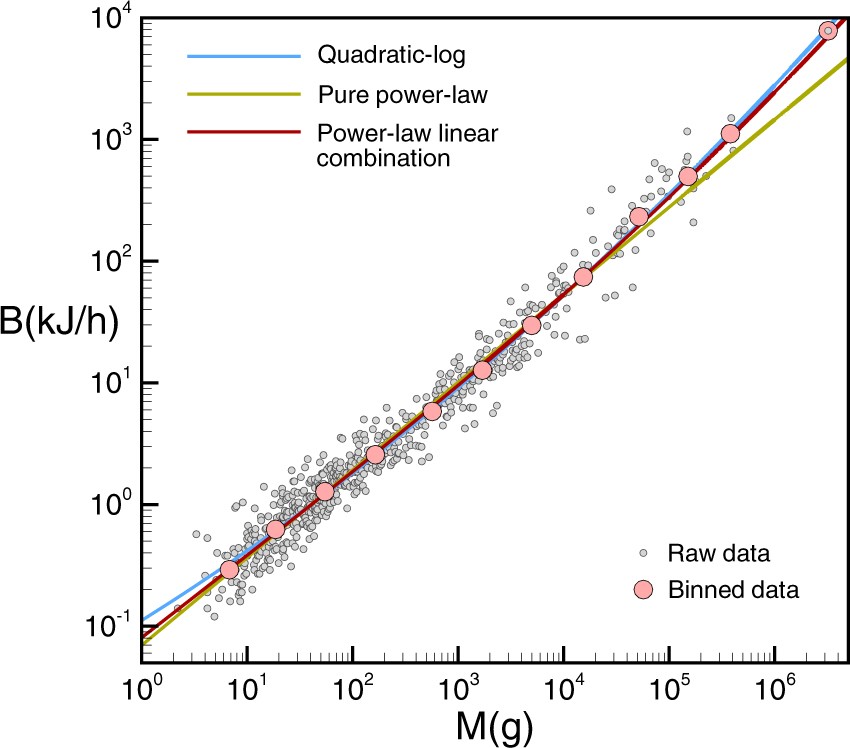
In R, arbitrary relations can be fit to the data using the nls() function, which stands for Nonlinear Least Squares and extends the least squares method to general function forms. Here, there’s no closed form solutions, and the optimal fit is found via numeric optimization (i.e. basically fancy guessing-and-checking). An optional start=list(...) argument can be set to pick initial starting guesses for the parameters.
nls_bmr <- nls(bmr_kjph ~ a*mass_g + b*mass_g^(2/3), data=bmr, start=list(a=1,b=1))
summary(nls_bmr)
Formula: bmr_kjph ~ a * mass_g + b * mass_g^(2/3)

Parameters:
   Estimate Std. Error t value Pr(>|t|)
a 1.746e-03  4.182e-05   41.76   <2e-16 ***
b 9.988e-02  5.293e-03   18.87   <2e-16 ***
---
Signif. codes:  0 '***' 0.001 '**' 0.01 '*' 0.05 '.' 0.1 ' ' 1

Residual standard error: 48.55 on 635 degrees of freedom

Number of iterations to convergence: 1
Achieved convergence tolerance: 5.902e-06
We can check this fit against our previous pure power law by extracting the coefficients from this new model and plotting both side by side:
coef(nls_bmr) a b
0.001746319 0.099879075
a <- coef(nls_bmr)[1] ; b <- coef(nls_bmr)[2]
ggplot(bmr,aes(mass_g,bmr_kjph)) + geom_point(size=.7,alpha=.5) +
  geom_smooth(aes(color="power law"), method=lm,se=F, linewidth=.7) +
  geom_function(aes(color="power-linear\ncombination"),
                fun=\(x)a*x+b*x^(2/3), linewidth=.7) +
  scale_x_log10(labels=scales::label_log()) + scale_y_log10() +
  scale_color_manual(breaks=c("power law","power-linear\ncombination"),
                     values=c("blue","red")) +
  labs(x = "Body mass (g)", y = "BMR (kJ/h)",
       title = "Log-log plot BMR vs body mass of various mammalian species")
This time, we must manually plot the residuals to view them properly:
bmr <- bmr %>% mutate(log_residuals = log10(bmr_kjph)-log10(a*mass_g+b*mass_g^(2/3)))
ggplot(bmr, aes(mass_g,log_residuals)) + geom_point() +
  scale_x_log10()
qqnorm(bmr$log_residuals)
We can also compute likelihood-based confidence intervals here with confint(), though this time they’re not based on t-distributions:
confint(nls_bmr, level = 0.95) 2.5% 97.5%
a 0.00166419 0.001828441
b 0.08948605 0.110272440It’s not immediately obvious here which model is superior; both seem to fit the data reasonably well.