6 Data Visualization
Descriptive statistics are a good place to start, but usually plotting your data visually is the best way to fully understand your dataset down to its core. In this next chapter, we will cover a variety of common plot types that are most useful for exploratory analysis.
When studying each plot type, it’s important to keep the following questions in mind:
- What kind of data is appropriate for this plot?
- How to create this plot?
- How to interpret this plot?
6.1 ggplot2
We will be making all plots using the ggplot2 package which is also a core Tidyverse package. It offers a robust syntax for easily creating and modifying plots (link to cheat sheet).
When making a ggplot2 plot, it’s important to remember everything is a layer that you add onto the base object using + just like adding numbers. Whether you’re adding a plot, a faceting structure, changing the axes, adding annotations (e.g. title/labels), etc. they’re all layers that are added. This may seem strange at first, but you’ll quickly grasp it in the examples that follow.
Let’s first import the necessary packages. We will need both readr and ggplot2 for reading and plotting data. For convenience, I’ll just load all core Tidyverse packages.
# if you need to, reimport all core tidyverse packages
library(tidyverse)

# optional: disable showing col_types by default in readr import functions
options(readr.show_col_types = FALSE)

# optional: set a prettier theme and colorblind-friendly palette for plots
#           (also looks better if printed with most printers, even in b/w)
theme_set(theme_bw())
options(ggplot2.discrete.fill = \(...) scale_fill_brewer(..., palette = "Set2"),
        ggplot2.discrete.colour = \(...) scale_color_brewer(..., palette = "Dark2"))
6.2 Palmer penguins
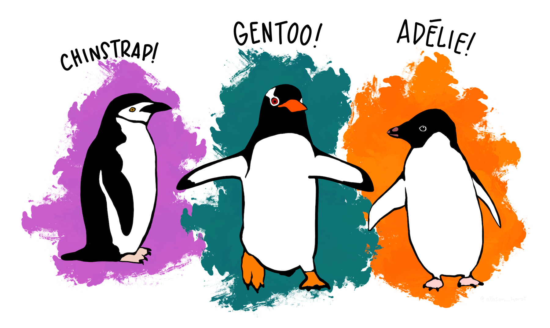
To properly demonstrate some of these plots, we need a slightly more feature-rich dataset. Let’s import the Palmer penguins dataset which is readily usable and has a good set of variables.22 I’ve removed a few rows with NAs for our convenience, here’s a link to the file: penguins.csv.
# load in the penguins dataset
# (note: a few rows with NAs have been removed for simplicity)
penguins <- read_csv("https://bwu62.github.io/stat240-revamp/data/penguins.csv")
# print the first few rows of the data frame to check;
# this data frame is now too wide for our screen,
# you can see some columns are cut off
print(penguins, n = 5)
# A tibble: 333 × 8
species island bill_length_mm bill_depth_mm flipper_length_mm body_mass_g sex
<chr> <chr> <dbl> <dbl> <dbl> <dbl> <chr>
1 Adelie Torgersen 39.1 18.7 181 3750 male
2 Adelie Torgersen 39.5 17.4 186 3800 female
3 Adelie Torgersen 40.3 18 195 3250 female
4 Adelie Torgersen 36.7 19.3 193 3450 female
5 Adelie Torgersen 39.3 20.6 190 3650 male
# ℹ 328 more rows
# ℹ 1 more variable: year <dbl>
# let's temporarily increase the width and reprint,
# so you can see all columns in the data frame
options(width = 92)
penguins
# A tibble: 333 × 8
species island bill_length_mm bill_depth_mm flipper_length_mm body_mass_g sex year
<chr> <chr> <dbl> <dbl> <dbl> <dbl> <chr> <dbl>
1 Adelie Torgersen 39.1 18.7 181 3750 male 2007
2 Adelie Torgersen 39.5 17.4 186 3800 female 2007
3 Adelie Torgersen 40.3 18 195 3250 female 2007
4 Adelie Torgersen 36.7 19.3 193 3450 female 2007
5 Adelie Torgersen 39.3 20.6 190 3650 male 2007
6 Adelie Torgersen 38.9 17.8 181 3625 female 2007
7 Adelie Torgersen 39.2 19.6 195 4675 male 2007
8 Adelie Torgersen 41.1 17.6 182 3200 female 2007
9 Adelie Torgersen 38.6 21.2 191 3800 male 2007
10 Adelie Torgersen 34.6 21.1 198 4400 male 2007
# ℹ 323 more rows
# reset width to its original value
options(width = 85)
# another option is the glimpse() function which prints sideways,
# avoiding the hidden columns due to insufficient width issue
glimpse(penguins)
Rows: 333
Columns: 8
$ species <chr> "Adelie", "Adelie", "Adelie", "Adelie", "Adelie", "Adelie…
$ island <chr> "Torgersen", "Torgersen", "Torgersen", "Torgersen", "Torg…
$ bill_length_mm <dbl> 39.1, 39.5, 40.3, 36.7, 39.3, 38.9, 39.2, 41.1, 38.6, 34.…
$ bill_depth_mm <dbl> 18.7, 17.4, 18.0, 19.3, 20.6, 17.8, 19.6, 17.6, 21.2, 21.…
$ flipper_length_mm <dbl> 181, 186, 195, 193, 190, 181, 195, 182, 191, 198, 185, 19…
$ body_mass_g <dbl> 3750, 3800, 3250, 3450, 3650, 3625, 4675, 3200, 3800, 440…
$ sex <chr> "male", "female", "female", "female", "male", "female", "…
$ year <dbl> 2007, 2007, 2007, 2007, 2007, 2007, 2007, 2007, 2007, 200…The column variables are intuitively named so you should be able to guess their meaning; see the penguins help page for more info on the variables as well as papers detailing the data gathering process.
6.3 One-variable plots
Ok, now we’re finally ready to learn some plots. We will start with simple one-variable plots, i.e. plots that can be made with a single column in a data frame. Depending on the type of that variable, you may decide to end up choosing between several different plot types. Note these plot types can also all be enhanced to visualize two variables, as we will soon demonstrate.
6.3.1 Histogram
Histograms are plots where numeric values are grouped into “bins” (i.e. intervals) and the count of each bin plotted as a bar. They are extremely effective at visualizing the distribution of a single numeric column, allowing you to easily see the shape, spread, and even skewness of a dataset. Histograms are one of the most common plots for numeric data.
The following code makes a basic histogram in R using ggplot.
ggplot(penguins, aes(x = flipper_length_mm)) + geom_histogram()
6.3.1.1 Interpretation
Looking at this plot, we can make a few key observations:
- The distribution of flipper length is bimodal, i.e. there are 2 peaks: around 190mm and 215mm.
- The peak around 190mm is higher (i.e. more numerous) than the peak around 215mm, but they have comparable spreads.
- This can mean either this group of observations is more prominent in the population studied, or was perhaps the result of some kind of selection or sampling bias.
- Between the two modes, between 200-205mm, there’s a noticeable “gap” with comparatively much fewer observations.
- The vast majority of observations are around 180-220mm, with a few extremes almost as low as 170mm or just slightly above 230mm.
6.3.1.2 Explanation of syntax:
The code may seem strange at first, but here’s a quick explanation:
- The
ggplot()function creates the base “plot object”, kind of like setting up a canvas in preparation for painting.ggplot()takes 2 arguments in order:- The first argument
penguinsis the data frame which will be used for the plot. As a general rule, always put all data you want to plot into a SINGLE data frame to pass toggplot(). - The second argument is an aesthetic mapping. Think of aesthetics as choosing how to display each column of variables in your data frame. Here’s a brief list of some common aesthetics you can map:
-
xcontrols the horizontal axis, -
ycontrols the vertical axis, -
colorandfillcontrol the point/line/boundary color and inside/fill colors respectively, -
shapeandsizecontrol point shapes and sizes respectively, -
linetypecontrols the type of line (i.e. solid, dashed, dotted, etc.)
-
- The first argument
- Once the base plot object is setup with a data frame and aesthetic mapping, you simply need to “add on” a plot layer like
geom_histogram()that specifies the type of plot you want and it will be drawn!- You can also specify the aesthetic mapping in the plot layer (e.g. inside
geom_histogram()), which will override the aesthetic mapping that it inherits from the baseggplot()object. Otherwise, the aesthetic mapping in the baseggplot()object will be used. For example, these will make the exact same plot:ggplot(penguins, aes(x = flipper_length_mm)) + geom_histogram()ggplot(penguins) + geom_histogram(aes(x = flipper_length_mm))
- You can also specify the aesthetic mapping in the plot layer (e.g. inside
Due to the slightly unusual nature of this syntax, there are a number of common failure modes we have observed. Make sure you take note of the following:
Plot layers are ALWAYS added with
+like numbers. This is just the design of the syntax. Attempting to use anything else will give errors!You also MUST execute each layer like a function with
(). If you try to just add+ geom_histogramwithout the(), the layer will not generate correctly and give errors!-
If you have many layers, it’s recommended to break them into multiple lines, but each incomplete line MUST have either an unclosed parenthetical
(OR end in an unfinished addition+, for example:# this is ok; R sees the incomplete lines # and continues reading the next line ggplot(penguins, # unclosed ( parenthetical aes(x = flipper_length_mm)) + # unfinished + addition geom_histogram()# but this will error, since the first line is NOT incomplete!! ggplot(penguins, aes(x = flipper_length_mm)) + geom_histogram()Error in `+.gg`: ! Cannot use `+` with a single argument. ℹ Did you accidentally put `+` on a new line?
Don’t forget if you have an incomplete ( somewhere, or didn’t finish a + statement, R will patiently wait for you by replacing the normal > prompt with a + prompt. Finish your line or hit ESC to quit.
6.3.1.3 Adding aesthetics
With ggplot2, you can easily add additional aesthetics to a plot, turning one-variable plots into two-variable plots, allowing you to visualize how they vary together. Remember how the histogram shows bimodality? It turns out these represent different species of penguins. Let’s use the fill aesthetic to differentiate between species.
ggplot(penguins, aes(x = flipper_length_mm, fill = species)) +
  geom_histogram()
By default, ggplot will stack bars with the same position along the horizontal axis. Let’s unstack them by setting position = "identity" and make the bars only 50% opaque by setting alpha = 0.5 so we can better see each group. Both these are set in the plot layer geom_histogram().
ggplot(penguins, aes(x = flipper_length_mm, fill = species)) +
  geom_histogram(position = "identity", alpha = 0.5)
This is already starting to look pretty good! We can now start to easily make a few interesting observations:
- Each species of penguin has a different average23 flipper length, with Gentoo penguins having the largest, Adelie penguins having the smallest, and Chinstrap penguins somewhere in between.
- There seems to be far more Adelie and Gentoo penguins in the dataset than Chinstrap penguins. We can investigate this further later.
Aesthetics should always be mapped to columns in the data frame. Also note when columns have proper names (i.e. have ONLY letters, numbers, periods, and underscores and NO spaces or other symbols) they do not need quotes " " when used inside ggplot (as well as most other Tidyverse functions).
All plots can be flipped (i.e. changed from horizontal to vertical or vice versa) by swapping the x and y aesthetics, i.e. using y = ... instead of x = ... or vice versa. In some cases this may be preferred (e.g. when a dataset has long labels) but generally it’s a matter of personal preference/style. Feel free to experiment with this yourself!
6.3.1.4 Title & labels
We should do one final thing before we are done with this plot: title and label it! This is something you should do for EVERY plot you make, not just in this class but throughout your data science career.
All plot annotations (e.g. titles, axes/data labels, legends, etc.) should meet the following criteria:
- Accuracy: all annotations should contain accurate information.
- Precision: strive to be precise (e.g. instead of “average”, specify mean, median, mode, or something else).
- Concision: strive to use as few words as necessary to convey only the most important information in the given context.
- Grammar/spelling: proper grammar and spelling should be used (abbreviations, if needed, should be standard and intuitive).
- Units: unless it’s extremely obvious (or unitless), the data units should also be specified!
Any plots submitted in this class without annotations or with annotations not meeting these criteria may be penalized!
Annotations are hard to get right sometimes; practice adding them to every plot, and think critically as you write them or as you read other peoples’ plots and you’ll get good fast.
You can add titles/labels by adding the labs() layer. Inside labs(), you can simultaneously set some/all of the following:
-
x = "..."ory = "..."sets axes labels forxory -
titlesets the plot title - labels for other aesthetics can also be set using the aesthetic name
- for example, if you used
fill, set its legend label withfill = "..."
- for example, if you used
- other less frequently used labels include
subtitle,caption, andaltfor alt-text
For example:
ggplot(penguins, aes(x = flipper_length_mm, fill = species)) +
  geom_histogram(position = "identity", alpha = 0.5) +
  labs(x = "Flipper length (mm)", y = "Count", fill = "Species",
    title = "Flipper length histograms of species in Palmer penguins sample")
This plot is now ready for use!
6.3.1.5 Extra options
90% of the time, the steps we went through above is all you need to completely prepare a plot for use. The other 10% of the time, you may need to configure the plot further. Each plot layer function has additional specific options you can set, so as usual check the help page or search online for more!
We will NOT cover every option for every plot type, but occasionally, we may highlight a few important options for you to experiment with and explore further on your own. For geom_histogram(), besides unstacking bars with position = "identity" argument as we showed above, you may also want to control how and where the bins are set. There’s several ways of doing this briefly outlined below—note you can only choose ONE method!
- You can set the
binsargument to set that many total bins, which will be used to evenly divide up the range of the data. E.g. by default,bins = 30is used to draw 30 bins, which is generally agreed to be a sensible default, even though it can create bins with strange decimal bounds (like in this example, where the bins are (170.98,173.02], (173.02,175.05], …, (229.98,232.02]).- If your data is integer-valued (like flipper length is here), this default method can actually cause problems, where some bins contain more whole numbers than others, creating strange artifacts in your data. For example, if we had two consecutive bins (1.8,3.2] and (3.2,4.6], even though they are both 1.4 units wide, the first covers 2 whole numbers (2 and 3) whereas the second only covers 1 whole number (just 4) which will distort the histogram shape.
- Alternatively, you can also set the
binwidthandboundaryarguments which will start at the given boundary and count up and down by the given binwidth to create all bins.- For example, if you want to make bins of (170,175], (175,180], …, (230,235], you can set
binwidth = 5andboundary = 170(or any other whole number divisible by 5).
- For example, if you want to make bins of (170,175], (175,180], …, (230,235], you can set
- For maximum control, you can also set
breaksequal to any numeric vector to use for the bin boundaries.- For example, the same breaks (170,175], (175,180], …, (230,235] can be chosen by setting
breaks = seq(170, 235, by = 5).
- For example, the same breaks (170,175], (175,180], …, (230,235] can be chosen by setting
Generally, you want to choose bins that are easy to visually interpret, so try using whole numbers that work well with our base-10 decimal system. You also want to avoid using too few or too many bins which can both cause problems.
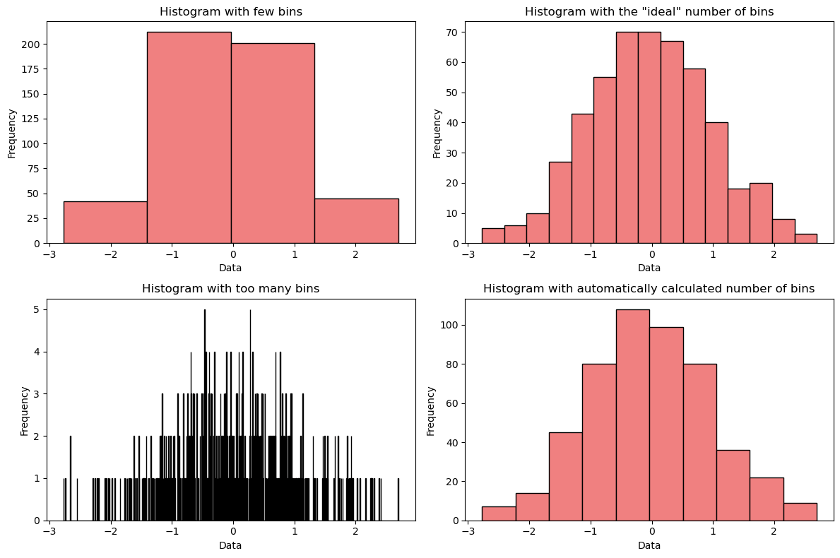
Let’s improve the plot one final time by setting these more sensible bin widths:
ggplot(penguins, aes(x = flipper_length_mm, fill = species)) +
  geom_histogram(position = "identity", alpha = 0.5,
                 binwidth = 5, boundary = 170) +
  labs(x = "Flipper length (mm)", y = "Count", fill = "Species",
    title = "Flipper length histograms of species in Palmer penguins sample")
This is now even easier to interpret, and the artifacts from the previous plots are gone. We can easily identify the average24 in each group, and even identify specific counts for specific bins (e.g. I can tell for example 39 penguins Adelie penguins were observed in the (190,195] bin).
6.3.2 Density plots
A common variation on the histogram is the density plot, which can be thought of as like a smoothed-curve version of a histogram, but with the area under the curve normalized to 1. It represents a guess of what the entire population distribution looks like based on a sample drawn. It can be created by adding geom_density() as a plot layer.
ggplot(penguins, aes(x = flipper_length_mm)) + geom_density()
Similar to the histogram, we can also add additional aesthetics to differentiate by species:
ggplot(penguins, aes(x = flipper_length_mm, fill = species)) +
  geom_density(alpha = 0.5) +
  labs(x = "Flipper length (mm)", y = "Density", fill = "Species",
    title = "Flipper length densities of species in Palmer penguins sample")
Note that this looks similar to the previously made histogram, but the Chinstrap distribution is no longer overshadowed by the other species, since the area normalization process effectively removes the effect sample size has on the height of the distribution of each species.
We will learn a lot more about density plots later in the inference portion of this course, but for now we will move on.
You can make the above plot even more accessible to readers with certain vision impairments by adding certain additional aesthetics. For example, try adding linetype = species to the aesthetic mapping (don’t forget to add a label for it inside labs()), as well as increasing border thickness by adding linewidth = 1 inside geom_density() and observe the output!
6.3.3 Box plots
Another common plot for numeric values is the box plot. Box plots are simply a way of showing the following 5 summary statistics on a number line:
- The minimum of the sample,
- The first quartile \(Q_1\), i.e. the 25th percentile,
- The median,
- The third quartile \(Q_3\), i.e. the 75th percentile, and
- The maximum of the sample.
\(Q_1\) and \(Q_3\) form the ends of the “box”, with the median shown as a line in between, while the min and max form the “whiskers” that stretch out on either end. Note the width of the box (i.e. \(Q_3-Q_1\)) is the IQR.
Compared to the histogram and density plot, there are a few key advantages and drawbacks:
- It’s easier to compare specific summary statistics like the median and quartiles using box plots,
- However it’s often less effective at communicating more complex features like modality and skew.
- Its simplicity sometimes works better for comparing many groups without appearing overly complex.
Let’s show both the five number summary with fivenum() as well as the corresponding box plot for the flipper length variable:
# get the min, q1, median, q3, and max:
fivenum(penguins$flipper_length_mm)
[1] 172 190 197 213 231
# turn these into a box plot
ggplot(penguins, aes(x = flipper_length_mm)) + geom_boxplot()
Note that even though we can easily identify the median, quartiles, and min/max, we can no longer observe bimodality like we previously did in the histogram or density plot. This is a tradeoff that is sometimes worth making and sometimes not.
The boxplot can also be easily adapted to highlight the difference between species, this time by adding a y aesthetic:
ggplot(penguins, aes(x = flipper_length_mm, y = species)) +
  geom_boxplot() +
  labs(x = "Flipper length (mm)", y = "Species",
       title = "Flipper length box plots of species in Palmer penguins sample")
This plot sacrifices the distributional complexity of the density plot, but in return we can very easily compare the summary statistics of each group, and overall arguably just “looks nicer” in my opinion.
Note 2 Adelie penguins were plotted as points instead, this is due to a common “rule of thumb” for box plots to label points more than 1.5×IQR away from each quartile as “outliers”. Again, this is simply a default convention. See the help page for more details, as well as how to disable this.
6.3.4 Bar plots
So far, we have only discussed visualizing 1 numeric variable, for which there are several interesting options as shown in the sections above, each with their own pros/cons.
For 1 categorical variable, bar plots where bars of varying heights are plotted for each category are the only real option. Generally, the most common thing to plot (without involving other columns) is either the count or proportion of each category observed in the sample. Note that for proportion, pie charts are also often used, but these have fallen out of fashion and are no longer recommended.
Confusingly, ggplot2 offers 2 different functions for making bar plots geom_bar() and geom_col() which appear similar but are NOT the same!
-
geom_bar()by default only accepts one aesthetic (eitherxorybut NOT both) and will tally a given column, counting the number of rows for each category and plotting the total counts. This is generally used with the full original dataset. -
geom_col()by default demands two aesthetics (bothxANDy) and performs no further computation and simply plots one against the other. This is generally used only with summaries of the dataset, NOT the full original dataset.
For example, we can use geom_bar() to compute AND plot the total count of each species in the sample:
ggplot(penguins, aes(x = species)) + geom_bar() +
  labs(x = "Species", y = "Count",
       title = "Count of each species in Palmer penguins sample")
If we wanted to make the same plot using geom_col(), we must FIRST summarize the dataset by computing the counts manually, then passing both the species and computed values in as x and y aesthetics, like this:
# we will learn later how to do this more efficiently with tidyverse,
# but for now we can summarize the counts using base R syntax
penguins_species_counts <- tibble(
  species = c("Adelie", "Chinstrap", "Gentoo"),
  count = c(
    sum(penguins$species == "Adelie"),
    sum(penguins$species == "Chinstrap"),
    sum(penguins$species == "Gentoo")
  )
)
# check the result
penguins_species_counts
# A tibble: 3 × 2
species count
<chr> <int>
1 Adelie 146
2 Chinstrap 68
3 Gentoo 119
# now, make the same plot using the summary data frame and geom_col()
ggplot(penguins_species_counts, aes(x = species, y = count)) + geom_col() +
  labs(x = "Species", y = "Count",
       title = "Count of each species in Palmer penguins sample")
In the next chapter, we will learn how to more efficiently summarize datasets into similar “summary” data frames like above, which will allow us to fully appreciate the versatility of geom_col().
6.3.4.1 Extra options
geom_bar() has two important arguments that significantly improve its utility. You can set stat = "summary" and fun = "..." where ... is the name of some summary function (e.g. mean, median, sd, var, IQR, range, or any other “summary” function, i.e. something that ingests a vector and outputs a single value). This will allow you to set the other axis aesthetic as well (e.g. y = ...) to another column which will be summarized using the given function.
For example, supposed we want to use a bar plot to compare the median flipper length for each species. We can set stat = "summary", fun = "median", and map y = flipper_length_mm to make the following plot:
ggplot(penguins, aes(x = species, y = flipper_length_mm)) +
  geom_bar(stat = "summary", fun = "median") +
  labs(x = "Species", y = "Median flipper length (mm)",
       title = "Median flipper length by species in Palmer penguins sample")
6.3.4.2 Adding aesthetics
Bar plots are also often good candidates for adding additional aesthetics like fill. I’ll show 2 examples of this: a stacked and unstacked bar version.
By default, adding fill creates a stacked bar plot, which is good for showing proportions of each bar with respect to a second categorical variable. For example, suppose we want to show which island each species came from. We can do this by adding fill = island to the aesthetic mapping:
ggplot(penguins, aes(x = species, fill = island)) + geom_bar() +
  labs(x = "Species", y = "Count", fill = "Island",
       title = "Count of each species (by island) in Palmer penguins sample")
We can also unstack the bars by setting position = "dodge" inside geom_bar(), making the bars appear side by side. For example, suppose we want to compare median flipper length not only by species but also by sex. We can easily do this by adding fill = sex to our aesthetic mapping, as well as setting position as mentioned above:
ggplot(penguins, aes(x = species, y = flipper_length_mm, fill = sex)) +
  geom_bar(stat = "summary", fun = "median", position = "dodge") +
  labs(x = "Species", y = "Median flipper length (mm)", fill = "Sex",
       title = "Median flipper length by species & sex in Palmer penguins sample")
6.4 Two-variable plots
In contrast with the previous types, the plot types below MUST be made with at least two variables; they are not possible with a single column.
6.4.1 Scatter plot
Scatter plots are perhaps the most famous plot type, and one most people are well familiar with. Scatter plots are your classic y vs x plot of two numeric variables as Cartesian coordinates on a 2-dimensional grid. To make a scatter plot with ggplot2, you just need to map the x and y aesthetics to two columns, then add geom_point() as a layer.
For example, suppose we want to make a scatter plot of flipper length vs bill depth to see if there is any correlation between the two. Note we always say y vs x, never x vs y. This would be the code:
ggplot(penguins, aes(y = flipper_length_mm, x = bill_depth_mm)) + geom_point() +
  labs(x = "Bill depth (mm)", y = "Flipper length (mm)",
       title = "Flipper length vs bill depth for Palmer penguins sample")
6.4.1.1 Adding aesthetics
It may surprise you to see that these two are negatively correlated, i.e. that an increase in bill depth seems to correlate with a decrease in flipper length, or vice versa. However, if we again add species to the plot, you will see an interesting pattern emerge.
To improve readability, we can set both the color and shape aesthetics to be controlled by the species column, as well as slightly increase the size of the points by setting size = 2 inside geom_point(), like this:
ggplot(penguins, aes(y = flipper_length_mm, x = bill_depth_mm,
                     color = species, shape = species)) +
  geom_point(size = 2) +
  labs(x = "Bill depth (mm)", y = "Flipper length (mm)",
       color = "Species", shape = "Species",
       title = "Flipper length vs bill depth by species for Palmer penguins sample")
Now we can clearly see bill depth and flipper length are in fact positively correlated within each species, as we might expect. This is an effect called Simpson’s paradox and arises surprisingly often in datasets, most notably in 1973 when UC Berkeley was accused of gender discrimination and almost sued.25
When making scatter plots, it’s important to remember that correlation does NOT necessarily imply causation. Do flippers grow longer BECAUSE they have long bills or vice versa? Obviously probably not, some penguins just grow bigger than others in their species by winning the genetic lottery and have bigger features overall.26
6.4.2 Smoothed trend curves/lines
We can also add a smoothed trend curve/line (depending on context) to this plot to highlight the direction of correlation within each species group. We do this by adding an additional geom_smooth() layer to the plot. By default, this will plot a smoothed trend curve (using LOESS smoothing) through each group:
ggplot(penguins, aes(y = flipper_length_mm, x = bill_depth_mm,
                     color = species, shape = species)) +
  geom_point(size = 2) + geom_smooth() +
  labs(x = "Bill depth (mm)", y = "Flipper length (mm)",
       color = "Species", shape = "Species",
       title = "Flipper length vs bill depth by species for Palmer penguins sample")
This is clearly not right here; the data shows strong signs of linearity. We can force geom_smooth() to fit and plot linear regression models to each species by setting method = lm. We can also turn off the unnecessarily cluttering gray error margins with se = FALSE and get this much improved plot:
ggplot(penguins, aes(y = flipper_length_mm, x = bill_depth_mm,
                     color = species, shape = species)) +
  geom_point(size = 2) + geom_smooth(method = lm, se = FALSE) +
  labs(x = "Bill depth (mm)", y = "Flipper length (mm)",
       color = "Species", shape = "Species",
       title = "Flipper length vs bill depth by species for Palmer penguins sample")
Note that since x, y, and color are set in the base ggplot() object, all subsequent layers automagically inherit those aesthetics; this is how both geom_point() and geom_smooth() know to use those aesthetic mappings to construct their own plot layers. Trend curves don’t make use of the shape aesthetic which only applies to the scatter plot layer, so that’s simply ignored by geom_smooth().
This is a good time to point out the difference between mapping an aesthetic in the base object vs mapping it in a plot layer.
In the last example code chunk above, note we set the x, y, color, and shape aesthetics all in the base ggplot() object, which is inherited by both the geom_point() and geom_smooth() layers. If instead we don’t want one of these to inherit certain aesthetics, we can set it directly in the other layer instead.
For example, suppose we each species to have points of differing color and shape, but we don’t want a different trend line for each species, but rather 1 single trend line across all points. We can easily achieve this by setting color and shape inside geom_point() instead of ggplot(). This will cause geom_smooth() to inherit only x and y from ggplot() and a single trend line will be made for all species:
ggplot(penguins, aes(y = flipper_length_mm, x = bill_depth_mm)) +
  geom_point(aes(color = species, shape = species), size = 2) +
  geom_smooth(method = lm, se = FALSE) +
  labs(x = "Bill depth (mm)", y = "Flipper length (mm)",
       color = "Species", shape = "Species",
       title = "Flipper length vs bill depth by species for Palmer penguins")
6.4.3 Line plots
For some specific datasets, especially chronological datasets where some variable is plotted against time, it may make sense to directly connect each individual data point with the points before and after it to form a line (or trace) plot. Note this is NOT the same as the smoothed trend plot shown above since for a line plot there is no smoothing performed!
Unfortunately, the Palmer penguins dataset isn’t the best example for this last plot type, so I’m temporarily borrowing another dataset for this example. The chunk below imports enrollment.csv which contains historic U.S. college enrollment data by each sex.
enrollment <- read_csv("https://bwu62.github.io/stat240-revamp/data/enrollment.csv")
# show a glimpse of the dataset
glimpse(enrollment)
Rows: 148
Columns: 3
$ year <dbl> 1947, 1947, 1948, 1948, 1949, 1949, 1950, 1950, 1951, 195…
$ sex <chr> "male", "female", "male", "female", "male", "female", "ma…
$ enrolled_millions <dbl> 1.659249, 0.678977, 1.709367, 0.694029, 1.721572, 0.72332…Here, each row is a pair of male and female college enrollment counts (in millions) for a specific year. We can obviously just make a scatter plot of enrollment vs year, with additional aesthetics differentiating between male and female data points, like this:
ggplot(enrollment, aes(x = year, y = enrolled_millions,
                       color = sex, shape = sex)) +
  geom_point(size = 2) +
  labs(x = "Time", y = "Enrolled (millions)",
       color = "Sex", shape = "Sex",
       title = "U.S. College enrollment by sex")
However, the chronological nature of this data means each data point has a specific predecessor and successor, i.e. for each point (except the end points) there are specific points that comes before and after it in chronological order. Thus, it makes more sense to connect these points with a single continuous line for each sex. This can be done by using geom_line() instead. We can also drop the shape aesthetic since it doesn’t apply to lines:
ggplot(enrollment, aes(x = year, y = enrolled_millions, color = sex)) +
  geom_line() +
  labs(x = "Time", y = "Enrolled (millions)", color = "Sex",
       title = "U.S. College enrollment by sex")
By default the line appears very thin and may be hard to read for some people. We can add linewidth = 1.2 to geom_line() to increase the thickness. We can also add another aesthetic linetype = sex for additional disambiguation so it’s extremely clear which line corresponds to which sex:
ggplot(enrollment, aes(x = year, y = enrolled_millions,
                       color = sex, linetype = sex)) +
  geom_line(linewidth = 1.2) +
  labs(x = "Time", y = "Enrolled (millions)",
       color = "Sex", linetype = "Sex",
       title = "U.S. College enrollment by sex")
We can see that since the late 70’s, college enrollment of female students has consistently outpaced that of male students.
For the purposes of this course, “line plot” or “trace plot” refer to geom_line(), and “smoothed line” or “trend line” or “straight line” refer to geom_smooth(method = lm). Take care not to mix these up!
6.4.4 Bonus: area plots
I wanted to throw in a bonus plot type here. This kind of composition-over-time data is also VERY commonly shown as a stacked area plot which can be made with geom_area(). I’ve also added a scale_fill_manual() configuration layer to manually specify a color palette to use more intuitive colors for each category.
ggplot(enrollment, aes(x = year, y = enrolled_millions, fill = sex)) +
  geom_area() + scale_fill_manual(values = c("#fb9a99", "#a6cee3")) +
  labs(x = "Time", y = "Enrolled (millions)", fill = "Sex",
       title = "U.S. College enrollment by sex")
Compared to line plots with one line per category, the stacked area plot has the advantage of easily showing both relative proportions of categories as well as total sum of all categories, but this comes at a cost of being able to easily compare individual categories to each other. So a tradeoff, as usual.
6.4.5 Aside: time axis
Note the previous example used just the year number on the horizontal axis (since the data was already summarized as annual totals) but you can of course also use dates on an axis. For a quick example, we can load the FRED U.S. unemployment rate dataset and plot it.
unemployment <- read_csv("https://fred.stlouisfed.org/graph/fredgraph.csv?id=UNRATE")
glimpse(unemployment)
Rows: 938
Columns: 2
$ observation_date <date> 1948-01-01, 1948-02-01, 1948-03-01, 1948-04-01, 1948-05-0…
$ UNRATE <dbl> 3.4, 3.8, 4.0, 3.9, 3.5, 3.6, 3.6, 3.9, 3.8, 3.7, 3.8, 4.0…
ggplot(unemployment, aes(x = observation_date, y = UNRATE)) + geom_line() +
  labs(x = "Time", y = "Unemployment rate (%)",
       title = "U.S. Unemployment rate")
The superficially look the same as the previous plot, however if we zoom in and plot just the last year of data, we can see the horizontal axis is in fact a special date type of axis:
# plot just the last 12 months of data
n = nrow(unemployment)
ggplot(unemployment[(n-11):n,], aes(x = observation_date, y = UNRATE)) + geom_line() +
  labs(x = "Time", y = "Unemployment rate (%)",
       title = "U.S. Unemployment rate")
The choppiness is because the data is only summarized monthly.
6.5 Facet subplots
Another way to incorporate additional aesthetics is to use facets, i.e. instead of having everything on one plot, breaking off into multiple subplots to visualize extra dimensions of your dataset.
There are two primary functions for this:
-
facet_wrap()creates a series of subplots along ONE additional categorical column with one panel for each category, then allows the plots to wrap onto multiple rows, the same way a sentence can wrap onto multiple lines. This is best for when you want to incorporate a single additional variable with many levels that wouldn’t all fit onto one row. -
facet_grid()creates a grid of subplots along one or two additional categorical column(s). You can make either a row of subplots, or a column of subplots, or even a matrix of them, incorporating two additional columns into your visualizations.
Let’s demonstrate each of these briefly.
6.5.1 facet_wrap()
Going back to the penguins dataset, suppose you wanted to look at the relationship between body mass and flipper length. You start by making this plot:
ggplot(penguins, aes(x = body_mass_g, y = flipper_length_mm)) + geom_point()
Maybe you decide to also incorporate species as a variable, so you can see if there are differences between the different species:
ggplot(penguins, aes(x = body_mass_g, y = flipper_length_mm,
                     color = species, shape = species)) +
  geom_point(size = 2)
Some interesting patterns start to emerge. Suppose you want to take this a step further and also incorporate sex, to see if that adds anything interesting to the picture. You could change for example the mapping to set shape = sex, but I think this results in a plot that’s a little too complicated and hard to read:
ggplot(penguins, aes(x = body_mass_g, y = flipper_length_mm,
                     color = species, shape = sex)) +
  geom_point(size = 2) +
  labs(x = "Body mass (g)", y = "Flipper length (mm)",
       title = "Flipper length vs body mass (by species & sex) for Palmer penguins")
A better way may be to facet_wrap() the species variable, and switch to using both color and shape to differentiate sex. The syntax for this is to add the faceting layer facet_wrap() with the argument ~species which will automagically split each species into its own facet subplot. You can also set ncol = 2 to control how/when to wrap the plots:
ggplot(penguins, aes(x = body_mass_g, y = flipper_length_mm,
                     color = sex, shape = sex)) +
  geom_point(size = 2) + facet_wrap(~species, ncol = 2) +
  labs(x = "Body mass (g)", y = "Flipper length (mm)", color = "Sex", shape = "Sex",
       title = "Flipper length vs body mass (by species & sex) for Palmer penguins")
6.5.2 facet_grid()
Suppose we wanted to look more closely again at the distribution of flipper lengths by both species and sex. We can start with the plot we made previously in section 6.3.2:
ggplot(penguins, aes(x = flipper_length_mm, fill = species)) +
  geom_density(alpha = 0.5) +
  labs(x = "Flipper length (mm)", y = "Density", fill = "Species",
       title = "Flipper length densities of species in Palmer penguins")
Suppose we want to also add sex in as a variable of interest, but we also want to more closely scrutinize the distributions. One way this can be done is to add the faceting layer facet_grid() with the argument sex ~ species which will construct a matrix of plots with one row for each sex and one column for each species:
ggplot(penguins, aes(x = flipper_length_mm)) + geom_density() +
  facet_grid(sex ~ species) +
  labs(x = "Flipper length (mm)", y = "Density",
       title = "Flipper length densities (by species & sex) in Palmer penguins")
You can also replace one side of the a ~ b syntax with a period . which will not facet in that direction. For example, sex ~ . will make a matrix of plots with one row for each sex, but only a single column all together, whereas . ~ species will make a matrix of plots with one column for each species, but only one row all together.
We can demonstrate both of these. Each time we can reassign the variable not faceted on (i.e. the one replaced with .) back to the fill aesthetic. For the second plot, we also flipped x and y to make better use of the tall-orientation of the available plot space.
ggplot(penguins, aes(x = flipper_length_mm, fill = species)) +
  geom_density(alpha = 0.5) + facet_grid(sex ~ .) +
  labs(x = "Flipper length (mm)", y = "Density", fill = "Species",
       title = "Flipper length densities (by species & sex) in Palmer penguins")
ggplot(penguins, aes(y = flipper_length_mm, fill = sex)) +
  geom_density(alpha = 0.5) + facet_grid(. ~ species) +
  labs(x = "Flipper length (mm)", y = "Density", fill = "Sex",
       title = "Flipper length densities (by species & sex) in Palmer penguins")
By default, both facet_wrap() and facet_grid() will match x and y axes across subplots. You can turn off either or both by setting the scales argument in your faceting function to either free_x or free_y to free one axis, or free to free both axes.
6.6 Scales
Generally, the default axes are fine, but if you need to you can modify them with scale layers. Scales control how every aesthetic is displayed on a plot, and there are scales for every aesthetic. Aesthetics added to a plot automatically come with a scale layer with default settings, but you can replace this with a custom-tuned scale with your own settings by adding another scale on.
Every scale layer has the following name pattern: scale_aes_type where aes and type are the name of the aesthetic and type of scale used. For example, if you’re making a density plot and set x = flipper_length_mm this is controlled by scale_x_continuous() because the flipper_length_mm column is a continuous, numeric type variable. However if you are making a bar plot and set x = species this is controlled by scale_x_discrete() since species is a discrete, categorical type variable.
These also apply to other aesthetics. If you set fill = species and color = sex by default these are controlled by scale_fill_discrete() and scale_color_discrete() since these are both discrete. There are automatic color choosing functions like scale_fill_brewer() and scale_color_brewer() which use the excellent Brewer color palettes, but you can also set your own with scale_fill_manual() and scale_color_manual().
With tidyverse loaded, try typing scale_ into the console and use the autocomplete popup (if it doesn’t appear automatically, use TAB to trigger it) to explore the different scale layers available. Hover over each scale function and read the short summary as well as scan the available arguments. If you need more details, check the help page!
We don’t have time to go into detail about every possible scale function; see this page on scales or read the help pages for a particular function for more info! Here’s an example of some of these scale layers being used to modify the last plot we made just above where we faceted by species:
ggplot(penguins, aes(y = flipper_length_mm, fill = sex)) +
  geom_density(alpha = 0.5) + facet_grid(. ~ species) +
  ggtitle("Flipper length densities (by species & sex) in Palmer penguins sample") +
  xlab("Density") + ylab("Flipper length (mm)") +
  scale_x_continuous(
    limits = c(0, 0.1),              # set limits
    breaks = seq(0, 0.08, 0.02),     # set breaks
    expand = 0                       # remove padding (extra spacing at either end)
    # if you need to transform x, you can also set transform = something (see help!)
  ) +
  scale_y_continuous(
    minor_breaks = seq(170, 230, 2), # set minor breaks
    expand = 0                       # remove padding here as well
  ) +
  scale_fill_manual(
    values = c("red", "blue")        # set custom colors, full list of possible names:
  )                                  # www.stat.columbia.edu/~tzheng/files/Rcolor.pdf
6.7 Other geoms
Many other geoms exist (see the ggplot2 cheat sheet for a full list). Here are just a few other extremely useful ones you should know about.
6.7.1 Straight lines
Sometimes you may want to draw specific lines to annotate your plot. You can use geom_hline(yintercept = ...), geom_vline(xintercept = ...), and geom_abline(slope = ..., intercept = ...) to manually draw horizontal, vertical, and arbitrary lines on top of another plot. You can also directly set things like color, alpha, linetype, or linewidth inside each function to control the style. If you need multiple lines, you can use a vector of inputs, or add multiple layers. For example:
ggplot(penguins, aes(x = body_mass_g, y = flipper_length_mm,
                     color = species, shape = species)) +
  geom_point(size = 2) +
  geom_hline(yintercept = c(190, 210), color = "navyblue", linetype = "dashed") +
  geom_vline(xintercept = 4500, linewidth = 2, alpha = 0.5) +
  geom_abline(slope = 0.015, intercept = 140, color = "magenta", size = 1)
6.7.2 Functions
Functions can be easily plotted with geom_function(fun = ...) where ... is the target function. This can be added either on top of an existing plot as another layer, or plotted by itself as a new plot, in which case the base object ggplot() requires no additional arguments.
If the function isn’t predefined, you can easily define it with \(x) ... for example:
ggplot() + geom_function(
  fun = \(x) x^2 + 1,      # define x²+1
  xlim = c(-2, 2),         # set limits
  n = 1e3                  # increase number of points used in drawing
)                          # (improves smoothness of resulting curve)
If the function exists, but you need to modify the arguments, you can use args = list(...) any arguments specified inside will be directly passed to the chose function, for example:
# plot the normal distribution with mean 10 sd 2
ggplot() + geom_function(
  fun = dnorm,                     # dnorm() is the normal distribution function
  args = list(mean = 10, sd = 2),  # set mean and sd arguments inside dnorm()
  xlim = c(4, 16),                 # set limits
  n = 1e3                          # increase number of points
)
6.8 Bonus: pairs plot
I didn’t know where to put this so I’m inserting it at the end of the chapter here. Here’s a bonus plot type for you called a pairs plot, where every variable in a data frame is plotted against every other variable. The primary purpose of this plot is to rapidly orient you to a new dataset you’re just starting to explore. It’s usually recommended to limit yourself to 5-6 variables max in a pairs plot, lest it become too chaotic.
There are many different implementations of this, but one of the best is GGally::ggpairs(). The plot type is automatically determined based on variable types and can be density, histogram, point, bar, box, or more, and additionally some summary statistics like correlations are given where appropriate.
# to run this chunk, you need to have the package GGally installed
# first, we subset out just a few columns (otherwise it gets too crazy)
# aes(color = species) is optional but improves the plot greatly
penguins_subset <- penguins[
  c("species", "body_mass_g", "bill_length_mm", "bill_depth_mm", "flipper_length_mm")
]
GGally::ggpairs(penguins_subset, aes(color = species))
This plot is recommended ONLY as an initial exploratory plot; it should NOT be used in a more purposeful setting like a report since it lacks direction/focus.
6.9 Further readings
These are beyond the scope of this course, but here’s a few other links if you want to learn more:
- If you haven’t already, make sure to check out the ggplot2 cheat sheet.
- If you need help picking a plot, Data to Viz has a nice flow chart with links to example R code.
- I also recommend scanning the Data to Viz page on caveats, i.e. common pitfalls in data science.
- You can add additional text annotations to your plots if necessary.
- You can also modify the coordinate systems, for example to make polar plots which are especially effective for cyclical or directional data.
- There are also other plot themes you can try out.
- Here’s a gallery of R plots if you want to learn more advanced types of plots and see examples of how to make them.